-
Share your thoughts on the... 2024 Met Gala
You are using an out of date browser. It may not display this or other websites correctly.
You should upgrade or use an alternative browser.
You should upgrade or use an alternative browser.
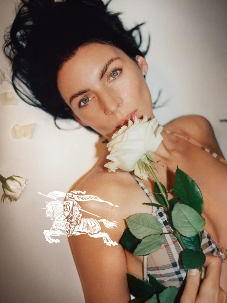
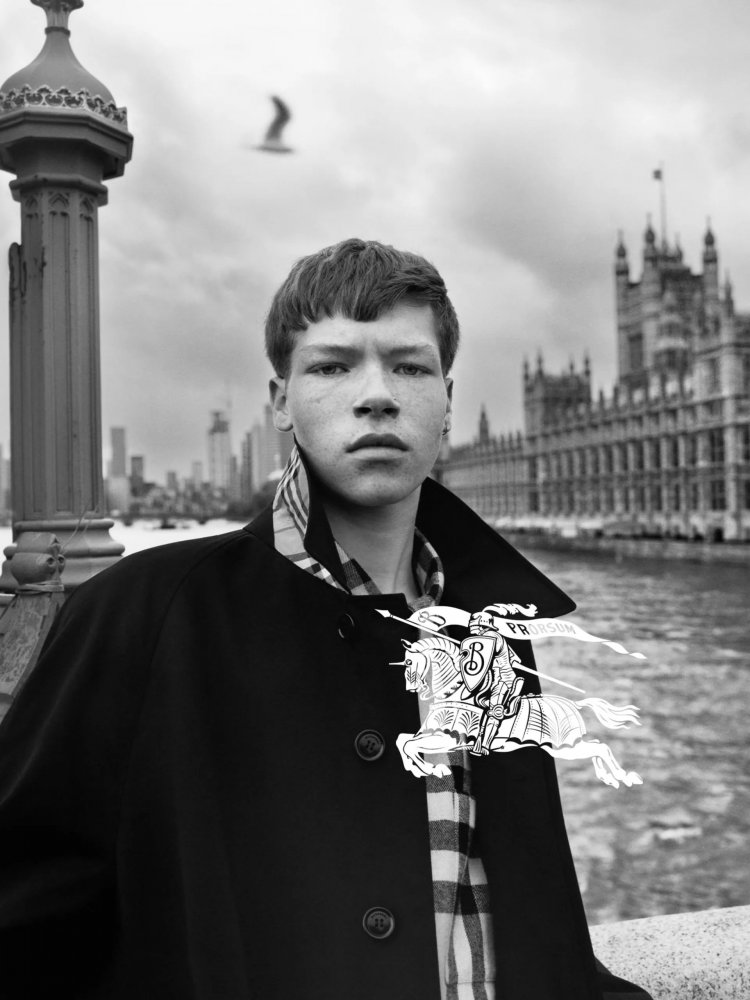
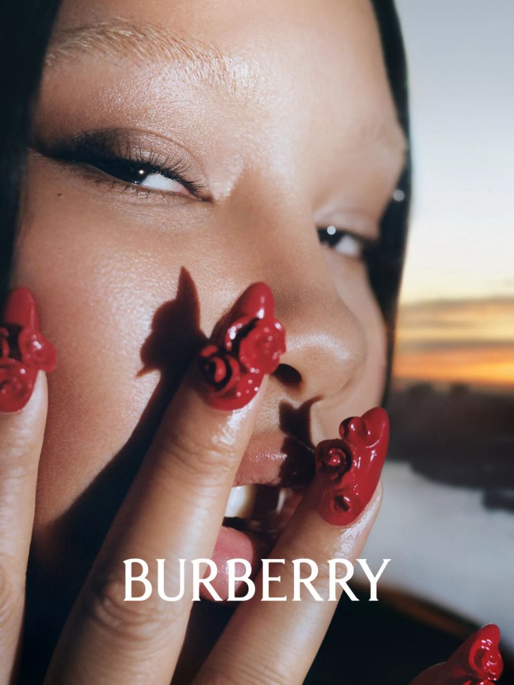
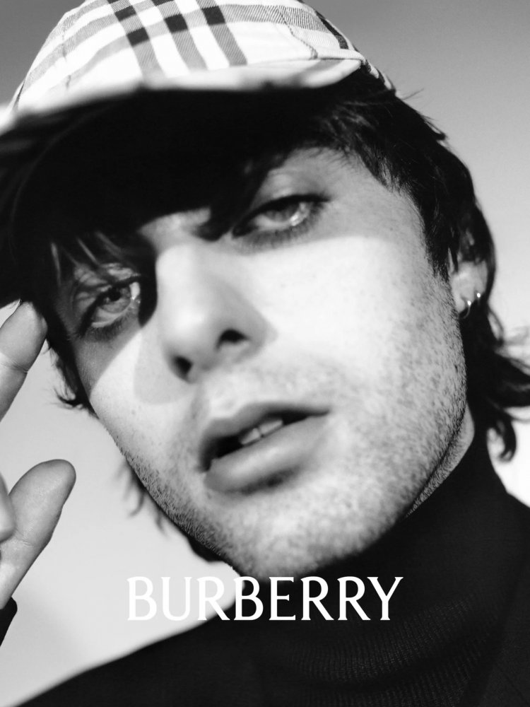
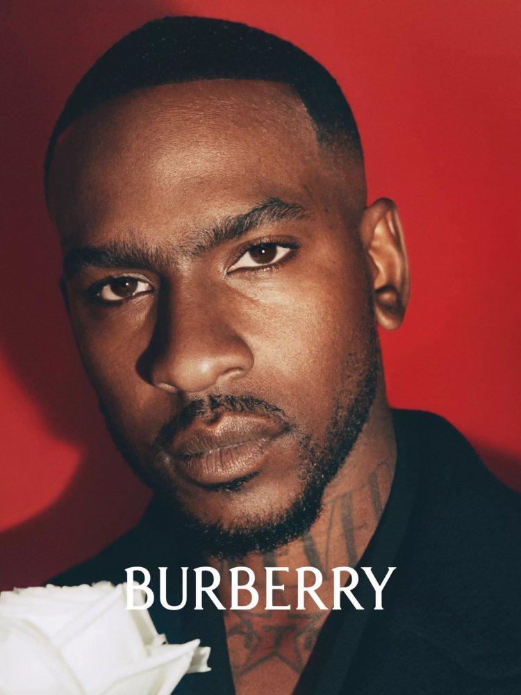
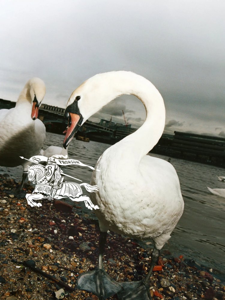
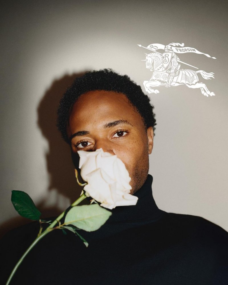
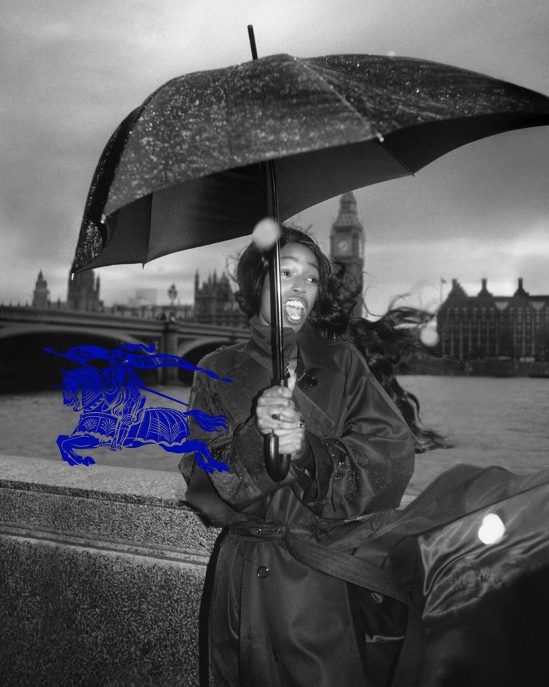
Burberry S/S 2023 by Tyrone Lebon
- Thread starter Yusuke
- Start date
zacatecas570
Well-Known Member
- Joined
- Sep 27, 2008
- Messages
- 7,059
- Reaction score
- 475
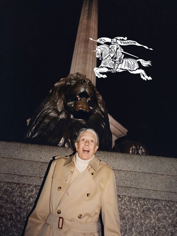
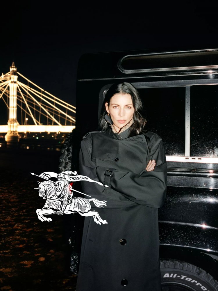
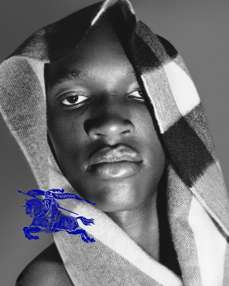
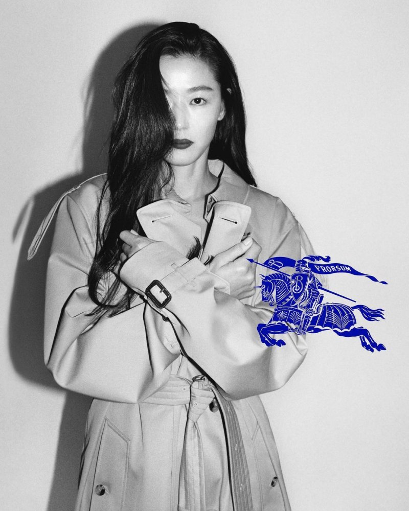
Another logo? Oh god, this is TERRIBLE
Urban Stylin
ɐʎ ʎǝɥ
- Joined
- Jul 16, 2003
- Messages
- 20,712
- Reaction score
- 3,296
It does look more Burberry than the previous designer but the placement of the new logo is crazy. I guess it will look better in print. Great to see Liberty Ross too
Benn98
Well-Known Member
- Joined
- Aug 6, 2014
- Messages
- 42,531
- Reaction score
- 20,537
It definitely looks more British and will connect with the 'fashion lovers' of the now, but I'm personally over this POP/iD aesthetic in photography.
It's time for fashion to get a bit more aspirational and polished.
It's time for fashion to get a bit more aspirational and polished.
kokobombon
Well-Known Member
- Joined
- Oct 7, 2007
- Messages
- 18,511
- Reaction score
- 1,775
Way better than previous campaigns imo but just not great.
WAVES
Well-Known Member
- Joined
- Aug 29, 2020
- Messages
- 2,737
- Reaction score
- 2,735
the placement of the ‘new’ symbol looks terrible who said yes to that? ruins the pictures who kinda leave me very unimpressed so far. they look like an editorial from Dazzed and Confused which, unfortunately seems to be a continuing trend in fashion…
the new logo looks cheap af.
the new logo looks cheap af.
Lax89
Well-Known Member
- Joined
- Sep 22, 2009
- Messages
- 1,702
- Reaction score
- 337
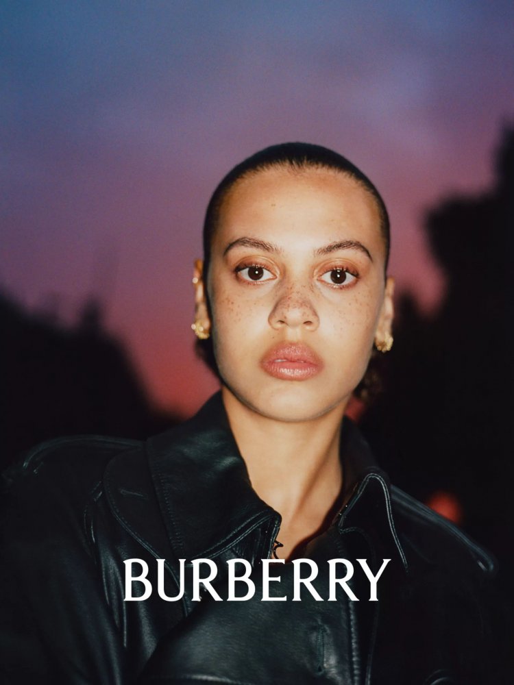
I don't understand the close-up shots that are not associated with full-length ones. For a fashion campaign, it doesn't really promote anything
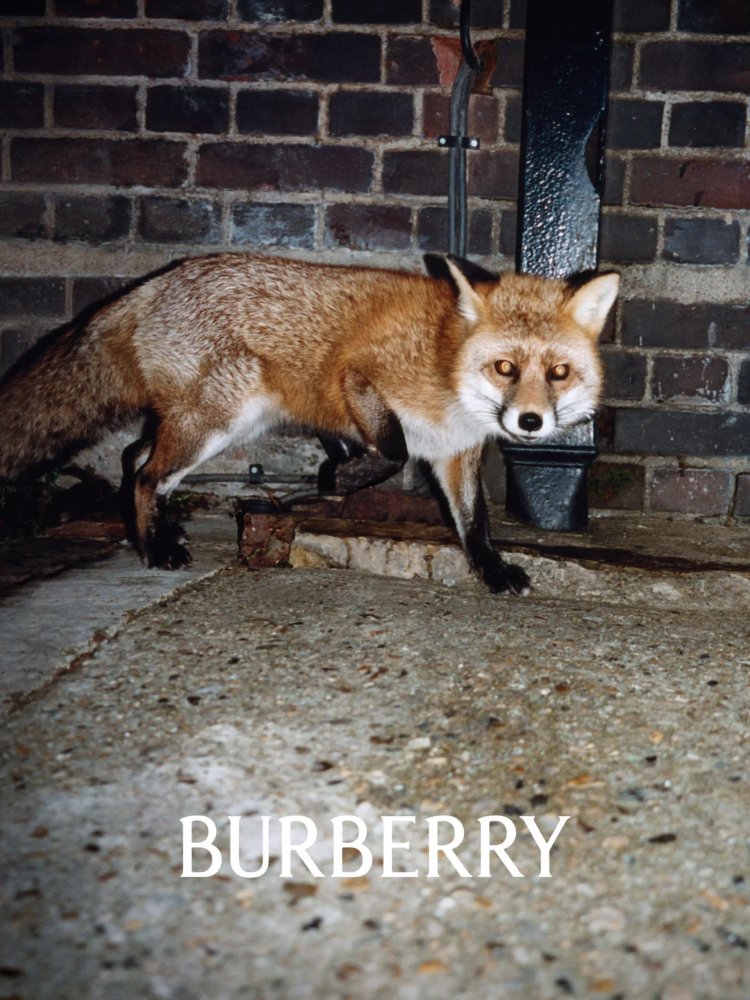
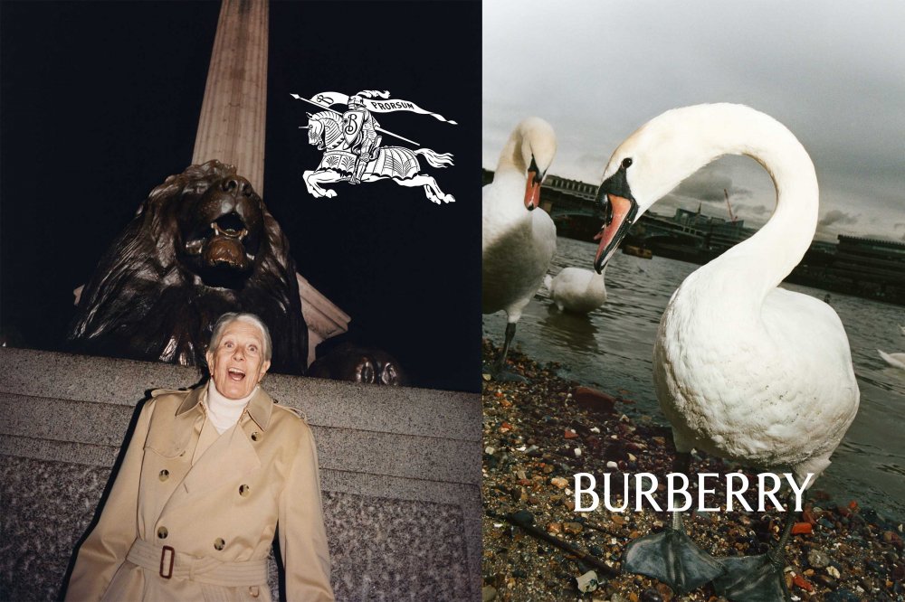
Also, the animal shots are random (but I understand they are britishness-associated) but why didn't they put accessories with them? At least, show something associated with the brand. It's not National Geographic
Also, the animal shots are random (but I understand they are britishness-associated) but why didn't they put accessories with them? At least, show something associated with the brand. It's not National Geographic
KoV
Well-Known Member
- Joined
- Sep 17, 2009
- Messages
- 5,251
- Reaction score
- 6,961
I love the return to this only slightly revised classic logo. The new font for "BURBERRY" is nice, too. Another rebrand might feel like overkill, but I think this was an absolute necessity and hopefully they can course-correct after the Tisci years.
The actual campaign isn't instilling in me a whole lot of confidence that will be be the case, though. Hopefully they're at least judicious about which of those images actually get printed.
The actual campaign isn't instilling in me a whole lot of confidence that will be be the case, though. Hopefully they're at least judicious about which of those images actually get printed.
Last edited:
Frederic01
Well-Known Member
- Joined
- Jun 7, 2021
- Messages
- 1,247
- Reaction score
- 2,163
yslforever
Well-Known Member
- Joined
- Nov 13, 2021
- Messages
- 864
- Reaction score
- 2,175
I think they just don't want to showcase previous Tisci's designs, they just want to turn a page and reset the mood; Burberry as quintessentially British, both classic even conservative and unique, even excentric in the same time.I don't understand the close-up shots that are not associated with full-length ones. For a fashion campaign, it doesn't really promote anything
Also, the animal shots are random (but I understand they are britishness-associated) but why didn't they put accessories with them? At least, show something associated with the brand. It's not National Geographic
Similar Threads
- Replies
- 23
- Views
- 8K
- Locked
- Replies
- 1K
- Views
- 221K
Users who are viewing this thread
Total: 2 (members: 0, guests: 2)


